Mastering the grammar
library(ggplot2)
mpg = na.omit(mpg)
# The fuel economy dataset, mpg, records make, model, class, engine size,
# transmission and fuel economy for a selection of US cars in 1999 and 2008
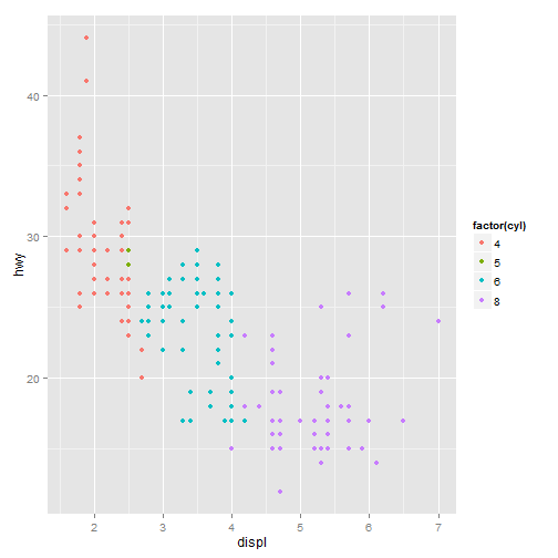
# A scatterplot of engine displacement in litres (displ) vs. average
# highway miles per gallon (hwy). # Points are coloured according to number
# of cylinders. This plot summarises the most important factor governing
# fuel economy: engine size.
qplot(displ, hwy, data = mpg, colour = factor(cyl))
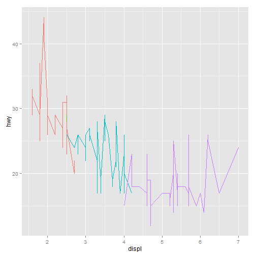
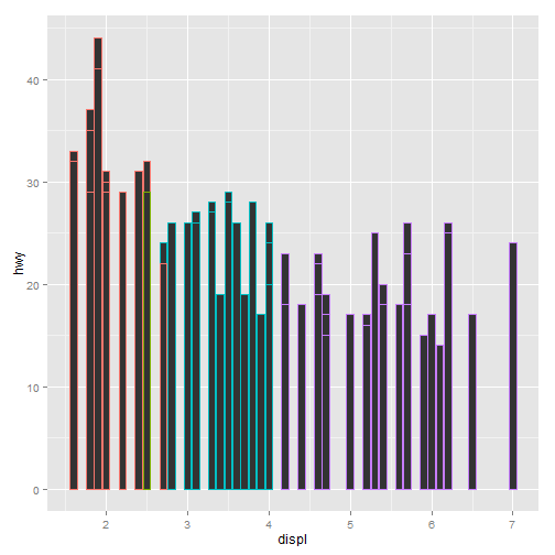
# Instead of using points to represent the data, we could use other geoms
# like lines (left) or bars (right).  Neither of these geoms makes sense for
# this data, but they are still grammatically valid.
qplot(displ, hwy, data = mpg, colour = factor(cyl), geom = "line") + theme(legend.position = "none")
qplot(displ, hwy, data = mpg, colour = factor(cyl), geom = "bar", stat = "identity",
position = "identity") + theme(legend.position = "none")
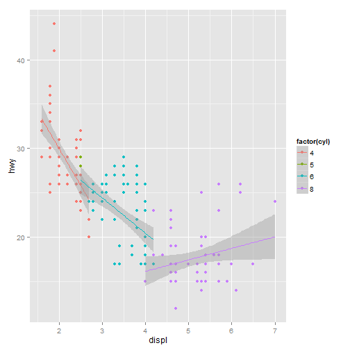
# More complicated plots don't have their own names. This plot overlays a
# per group regression line on the existing plot.  What would you call this
# plot?
qplot(displ, hwy, data = mpg, colour = factor(cyl)) + geom_smooth(data = subset(mpg,
cyl != 5), method = "lm")
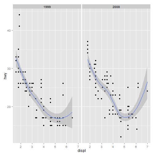
# A more complex plot with facets and multiple layers.
qplot(displ, hwy, data = mpg, facets = . ~ year) + geom_smooth()
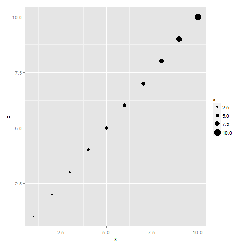
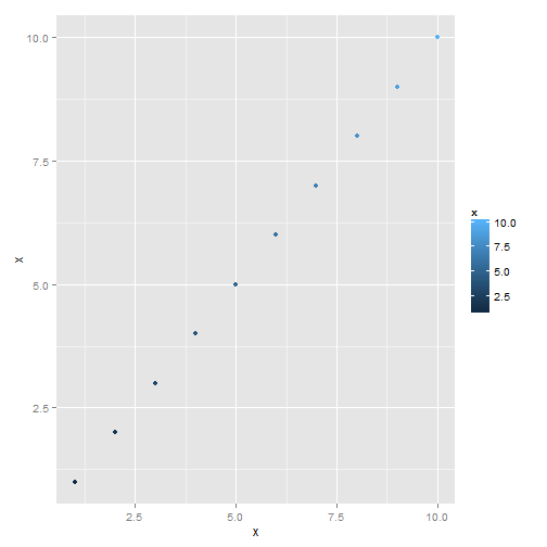
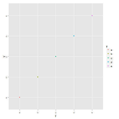
# Examples of legends from four different scales.  continuous variable
# mapped to size, and to colour, discrete variable mapped to shape, and to
# colour.  The ordering of scales seems upside-down, but this matches the
# labelling of the $y$-axis: small values occur at the bottom.
x <- 1:10
y <- factor(letters[1:5])
qplot(x, x, size = x)
qplot(x, x, 1:10, colour = x)
qplot(y, y, 1:10, shape = y)
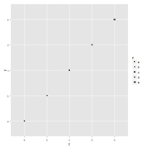
qplot(y, y, 1:10, colour = y)
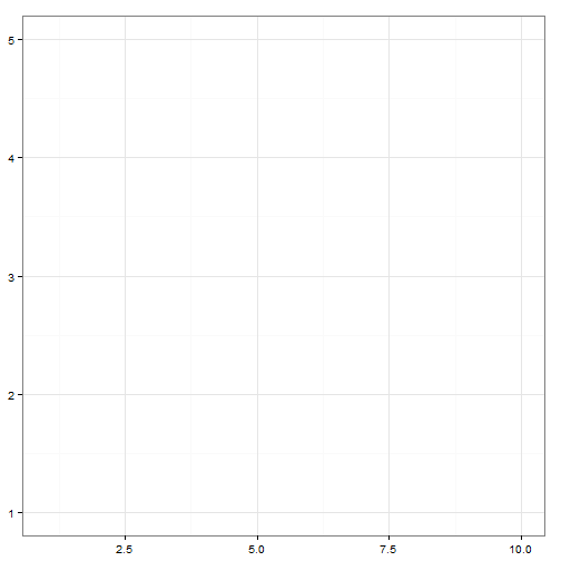
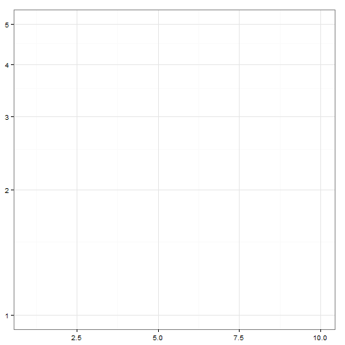
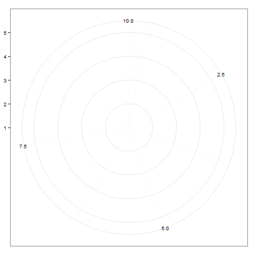
# Examples of axes and grid lines for three coordinate systems: Cartesian,
# semi-log and polar.  The polar coordinate system illustrates the
# difficulties associated with non-Cartesian coordinates: it is hard to draw
# the axes well.
x1 <- c(1, 10)
y1 <- c(1, 5)
p <- qplot(x1, y1, geom = "blank", xlab = NULL, ylab = NULL) + theme_bw()
p
p + coord_trans(y = "log10")
p <- qplot(displ, hwy, data = mpg, colour = factor(cyl))
summary(p)
data: manufacturer, model, displ, year, cyl, trans, drv, cty, hwy,
fl, class [234x11]
mapping:  colour = factor(cyl), x = displ, y = hwy
faceting: facet_null()
-----------------------------------
geom_point:
stat_identity:
position_identity: (width = NULL, height = NULL)
# Save plot object to disk
save(p, file = "plot.rdata")
# Load from disk
load("plot.rdata")
# Save png to disk
ggsave("plot.png", width = 5, height = 5)
Further reading