Terminology
- The data that you want to visualise
-
Geometric objects, geoms for short, represent what you actually see on the plot: points, lines, polygons, etc.
-
Statistical transformations, stats for short, summarise data in many useful ways. optional, but very useful.
-
The scales map values in the data space to values in an aesthetic space, whether it be colour, or size, or shape.
-
A coordinate system, coord for short, describes how data coordinates are mapped to the plane of the graphic. It also provides axes and gridlines to make it possible to read the graph.
- A faceting specification describes how to break up the data into subsets and how to display those subsets as small multiples.
Getting started with qplot
library(ggplot2)
diamonds <- na.omit(diamonds)  # remove rows with NA
dim(diamonds)
[1] 53940 10
set.seed(9999)  # Make the sample reproducible
dsmall <- diamonds[sample(nrow(diamonds), 1000), ]
Basic use
# the first two arguments give the x- and y-coordinates
qplot(carat, price, data = diamonds)
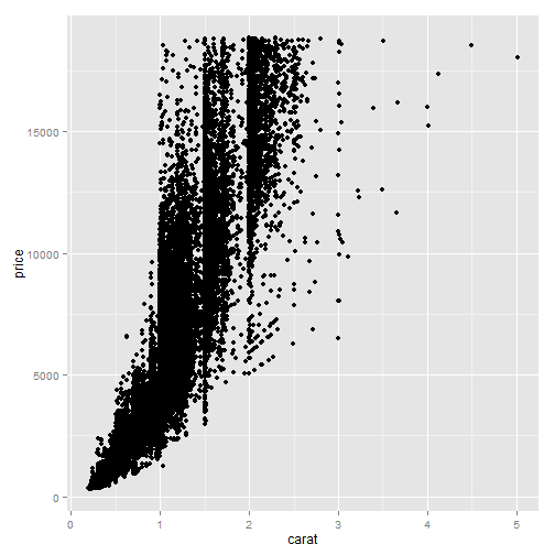
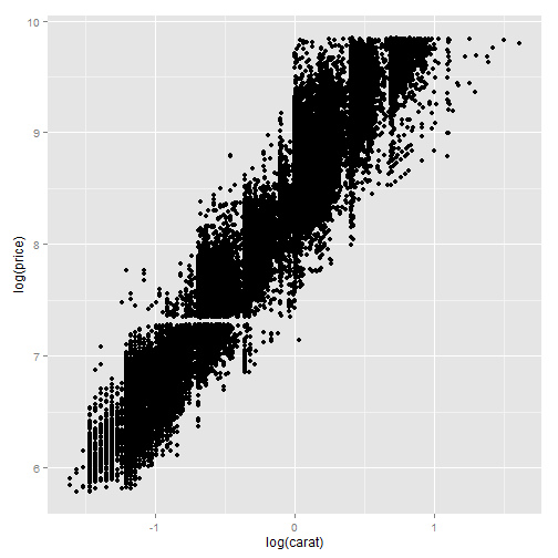
# The relationship looks exponential, we’d like to do is to transform the
# variables
qplot(log(carat), log(price), data = diamonds)
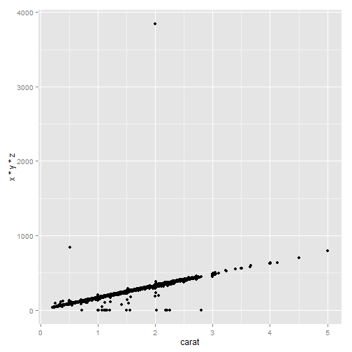
# Arguments can also be combinations of existing variables
qplot(carat, x * y * z, data = diamonds)
Colour, size, shape and other aesthetic attributes
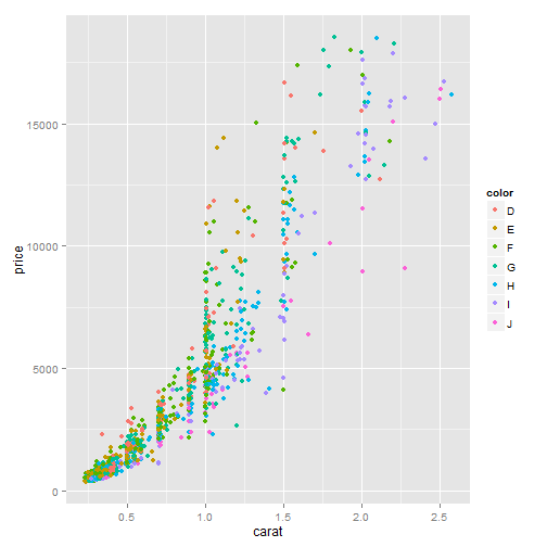
# Mapping point colour to diamond colour
qplot(carat, price, data = dsmall, colour = color)
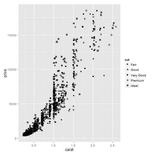
# Mapping point shape to cut quality (right).
qplot(carat, price, data = dsmall, shape = cut)
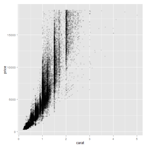
# Reducing the alpha value to 1/10 to makes it possible to see where the
# bulk of the points lie.  the denominator specifies the number of points
# that must overplot to get a completely opaque colour.
qplot(carat, price, data = diamonds, alpha = I(1/10))
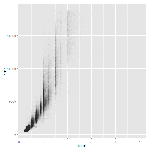
# Reducing the alpha value to 1/100,
qplot(carat, price, data = diamonds, alpha = I(1/100))
Plot geoms
- geom = “point” draws points to produce a scatterplot. default
- geom = “smooth” fits a smoother to the data and displays the smooth and its standard error
- geom = “boxplot” produces a box-and-whisker plot
- geom = “path” and geom = “line” draw lines between the data points.
- geom = “histogram” draws a histogram. default
- geom =”freqpoly” a frequency polygon.
- geom = “density” creates a density plot
- geom = “bar” makes a bar chart
Adding a smoother to a plot
library(splines)
library(mgcv)
# Smooth curves add to scatterplots The geoms will be overlaid in the order
# in which they appear.
qplot(carat, price, data = dsmall, geom = c("point", "smooth"), method = "gam",
formula = y ~ s(x, bs = "cs"))

# The effect of the span parameter. The wiggliness of the line is controlled
# by the span parameter, which ranges from 0 (exceedingly wiggly) to 1 (not
# so wiggly)
qplot(carat, price, data = dsmall, geom = c("point", "smooth"), span = 0.2)

qplot(carat, price, data = dsmall, geom = c("point", "smooth"), span = 1)

# more method available: loess, gam, lm, rlm
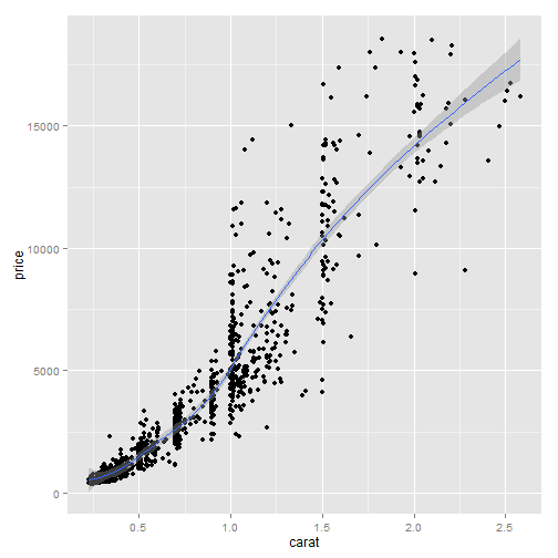
# The effect of the formula parameter, using a generalised additive model as
# a smoother.
qplot(carat, price, data = dsmall, geom = c("point", "smooth"), method = "gam",
formula = y ~ s(x))
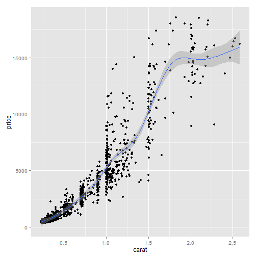
# default when there are more than 1,000 points
qplot(carat, price, data = dsmall, geom = c("point", "smooth"), method = "gam",
formula = y ~ s(x, bs = "cs"))

# The effect of the formula parameter using a linear model as a smoother.
qplot(carat, price, data = dsmall, geom = c("point", "smooth"), method = "lm")
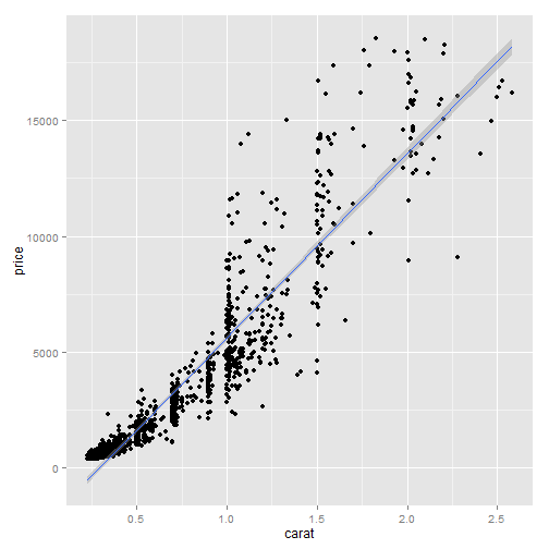
# the default
qplot(carat, price, data = dsmall, geom = c("point", "smooth"), method = "lm",
formula = y ~ ns(x, 5))
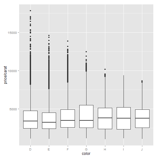
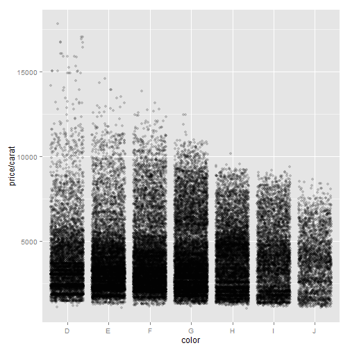
Boxplots and jittered points
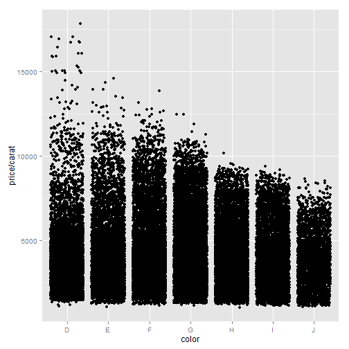
# Using jittering and boxplots to investigate the distribution of price per
# carat, conditional on colour.  As the colour improves (from left to right)
# the spread of values decreases, but there is little change in the centre
# of the distribution.
qplot(color, price/carat, data = diamonds, geom = "jitter")
qplot(color, price/carat, data = diamonds, geom = "boxplot")
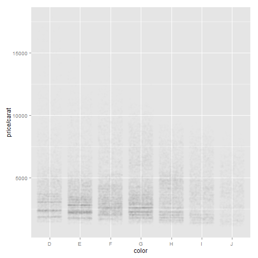
# Varying the alpha level.  From left to right: $1/5$, $1/50$, $1/200$.  As
# the opacity decreases we begin to see where the bulk of the data lies.
# However, the boxplot still does much better.
qplot(color, price/carat, data = diamonds, geom = "jitter", alpha = I(1/5))
qplot(color, price/carat, data = diamonds, geom = "jitter", alpha = I(1/50))
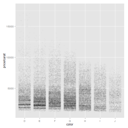
qplot(color, price/carat, data = diamonds, geom = "jitter", alpha = I(1/200))
Histogram and density plots
# Displaying the distribution of diamonds.
qplot(carat, data = diamonds, geom = "histogram")
qplot(carat, data = diamonds, geom = "density")
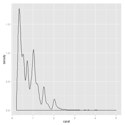
# For the density plot, the **adjust** argument controls the degree of
# smoothness (high values of adjust produce smoother plots). For the
# histogram, the **binwidth** argument controls the amount of smoothing by
# setting the bin size.
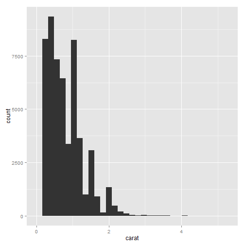
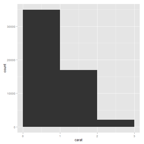
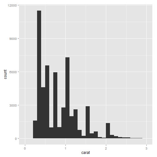
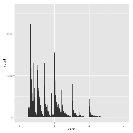
# Varying the bin width on a histogram of carat reveals interesting
# patterns. Binwidths from left to right: 1, 0.1 and 0.01 carats. Only
# diamonds between 0 and 3 carats shown.
qplot(carat, data = diamonds, geom = "histogram", binwidth = 1, xlim = c(0,
3))
qplot(carat, data = diamonds, geom = "histogram", binwidth = 0.1, xlim = c(0,
3))
qplot(carat, data = diamonds, geom = "histogram", binwidth = 0.01, xlim = c(0,
3))
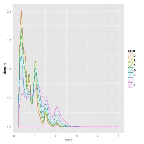
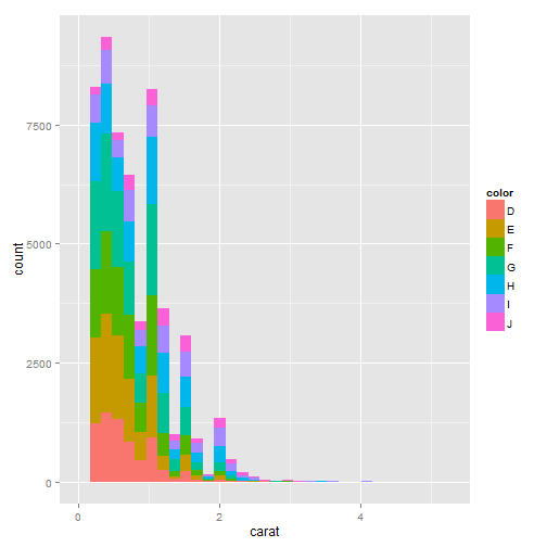
# Mapping a categorical variable to an aesthetic will automatically split up
# the geom by that variable.  Density plots are overlaid
qplot(carat, data = diamonds, geom = "density", colour = color)
# histograms are stacked.
qplot(carat, data = diamonds, geom = "histogram", fill = color)
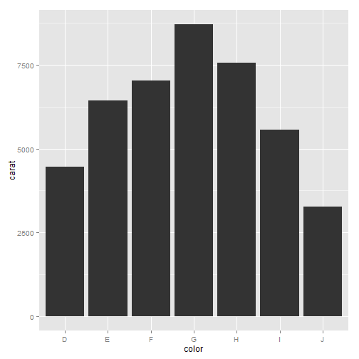
Bar charts
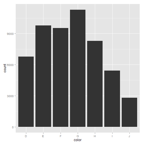
# Bar charts of diamond colour.  The first plot is a simple bar chart of
# diamond colour, and the second is a bar chart of diamond colour weighted
# by carat.
qplot(color, data = diamonds, geom = "bar")
qplot(color, data = diamonds, geom = "bar", weight = carat) + scale_y_continuous("carat")
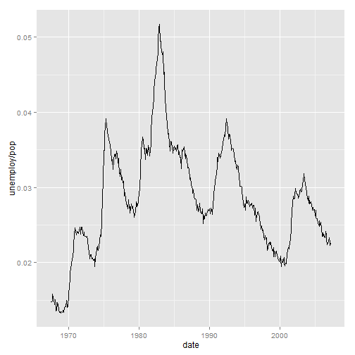
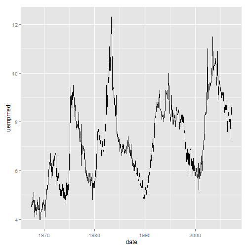
Time series with line and path plots
# Line plots join the points from left to right, while path plots join them
# in the order that they appear in the dataset

# Two time series measuring amount of unemployment.

# Percent of population that is unemployed
qplot(date, unemploy/pop, data = economics, geom = "line")
# median number of weeks unemployed.
qplot(date, uempmed, data = economics, geom = "line")
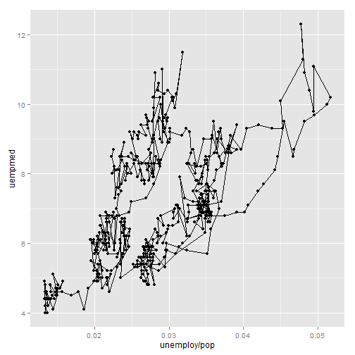
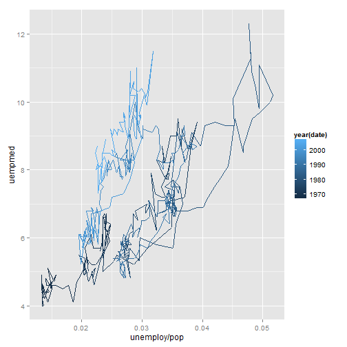
# Path plots illustrating the relationship between percent of people
# unemployed and median length of unemployment.
year <- function(x) as.POSIXlt(x)$year + 1900

# Scatterplot with overlaid path.
qplot(unemploy/pop, uempmed, data = economics, geom = c("point", "path"))
# Pure path plot coloured by year.
qplot(unemploy/pop, uempmed, data = economics, geom = "path", colour = year(date)) +
scale_size_area()
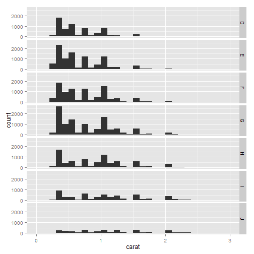
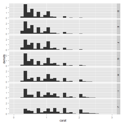
Faceting
# It creates tables of graphics by splitting the data into subsets and
# displaying the same graph for each subset in an arrangement that
# facilitates comparison

# The density plot makes it easier to compare distributions ignoring the
# relative abundance of diamonds within each colour. High-quality diamonds
# (colour D) are skewed towards small sizes, and as quality declines the
# distribution becomes more flat.

# Histograms showing the distribution of carat conditional on colour.  Bars
# show counts
qplot(carat, data = diamonds, facets = color ~ ., geom = "histogram", binwidth = 0.1,
xlim = c(0, 3))
# bars show densities (proportions of the whole).
qplot(carat, ..density.., data = diamonds, facets = color ~ ., geom = "histogram",
binwidth = 0.1, xlim = c(0, 3))
Other options
- xlim, ylim: set limits for the x- and y-axes
- log: a character vector indicating which (if any) axes should be logged. For example, log=”x” will log the x-axis, log=”xy” will log both.
- main: main title for the plot, centered in large text at the top of the plot.
- xlab, ylab: labels for the x- and y-axes.
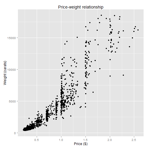
qplot(carat, price, data = dsmall, xlab = "Price ($)", ylab = "Weight (carats)",
main = "Price-weight relationship")
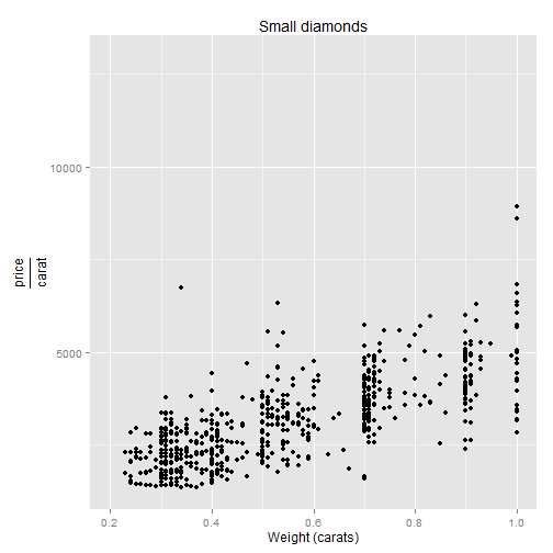
qplot(carat, price/carat, data = dsmall, ylab = expression(frac(price, carat)),
xlab = "Weight (carats)", main = "Small diamonds", xlim = c(0.2, 1))
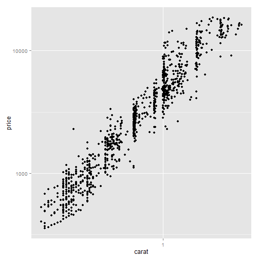
qplot(carat, price, data = dsmall, log = "xy")