library(ggplot2)
library(gridExtra)
mtc <- mtcars
head(mtc)
mpg cyl disp  hp drat    wt  qsec vs am gear carb
Mazda RX4         21.0   6  160 110 3.90 2.620 16.46  0  1    4    4
Mazda RX4 Wag     21.0   6  160 110 3.90 2.875 17.02  0  1    4    4
Datsun 710        22.8   4  108  93 3.85 2.320 18.61  1  1    4    1
Hornet 4 Drive    21.4   6  258 110 3.08 3.215 19.44  1  0    3    1
Hornet Sportabout 18.7   8  360 175 3.15 3.440 17.02  0  0    3    2
Valiant           18.1   6  225 105 2.76 3.460 20.22  1  0    3    1
Scatterplots
Basic scatterplot
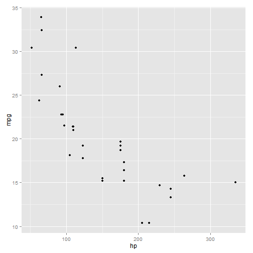
p1 <- ggplot(mtc, aes(x = hp, y = mpg))
# Print plot with default points
p1 + geom_point()
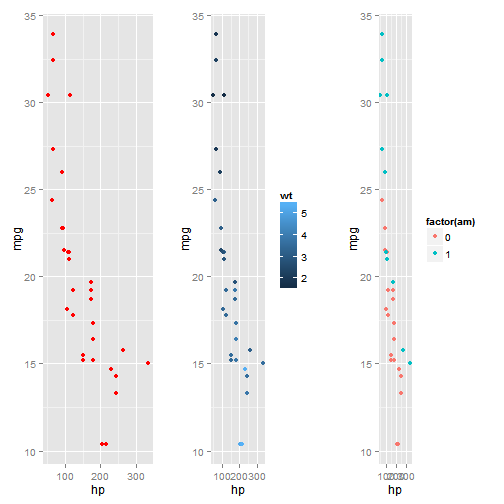
Change color of points
p2 <- p1 + geom_point(color = "red") #set one color for all points
p3 <- p1 + geom_point(aes(color = wt)) #set color scale by a continuous variable
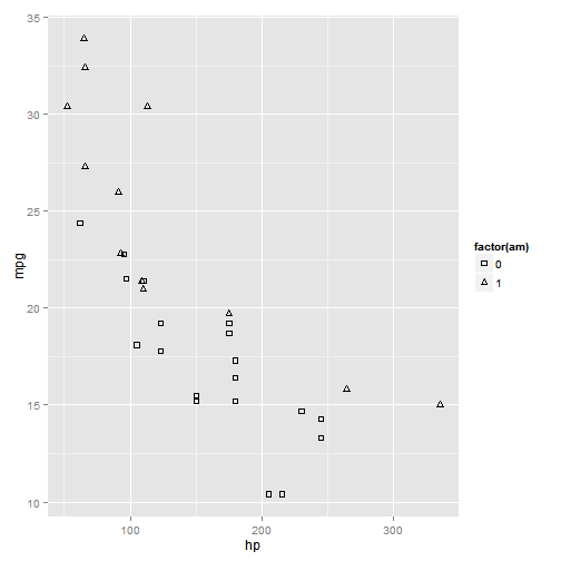
p4 <- p1 + geom_point(aes(color = factor(am))) #set color scale by a factor variable
grid.arrange(p2, p3, p4, nrow = 1)
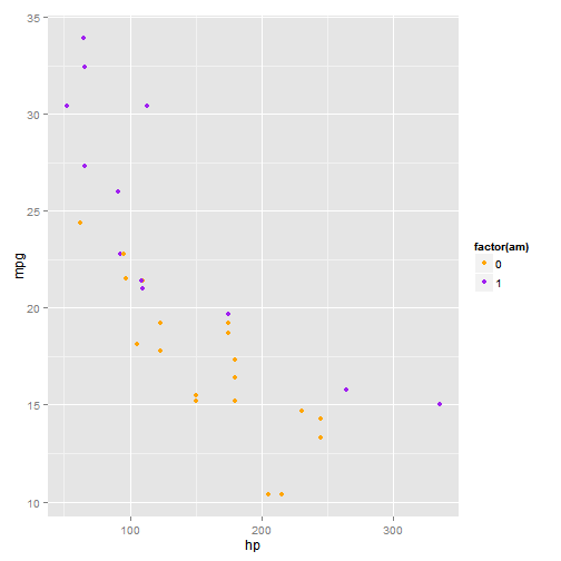
# Change default colors in color scale
p1 + geom_point(aes(color = factor(am))) + scale_color_manual(values = c("orange",
"purple"))
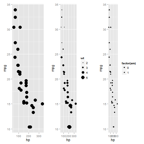
Change shape or size of points
p2 <- p1 + geom_point(size = 5)  #increase all points to size 5
p3 <- p1 + geom_point(aes(size = wt))  #set point size by continuous variable
p4 <- p1 + geom_point(aes(shape = factor(am)))  #set point shape by factor variable
grid.arrange(p2, p3, p4, nrow = 1)
# change the default shapes
p1 + geom_point(aes(shape = factor(am))) + scale_shape_manual(values = c(0,
2))
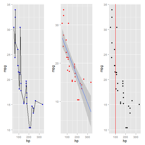
Add lines to scatterplot
p2 <- p1 + geom_point(color = "blue") + geom_line()  #connect points with line
p3 <- p1 + geom_point(color = "red") + geom_smooth(method = "lm", se = TRUE)  #add regression line
p4 <- p1 + geom_point() + geom_vline(xintercept = 100, color = "red")  #add vertical line
grid.arrange(p2, p3, p4, nrow = 1)
# take out the points, and just create a line plot, and change size and
# color as before
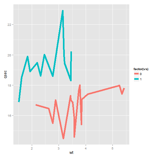
ggplot(mtc, aes(x = wt, y = qsec)) + geom_line(size = 2, aes(color = factor(vs)))
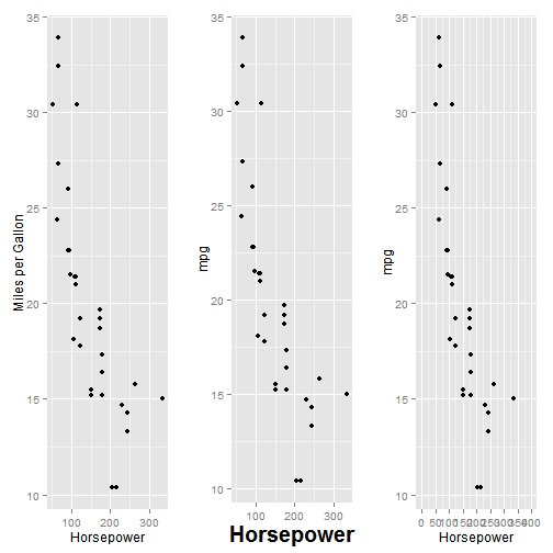
Change axis labels
p2 <- ggplot(mtc, aes(x = hp, y = mpg)) + geom_point()

# label all axes at once
p3 <- p2 + labs(x = "Horsepower", y = "Miles per Gallon")

# label and change font size
p4 <- p2 + theme(axis.title.x = element_text(face = "bold", size = 20)) + labs(x = "Horsepower")

# adjust axis limits and breaks
p5 <- p2 + scale_x_continuous("Horsepower", limits = c(0, 400), breaks = seq(0,
400, 50))

grid.arrange(p3, p4, p5, nrow = 1)
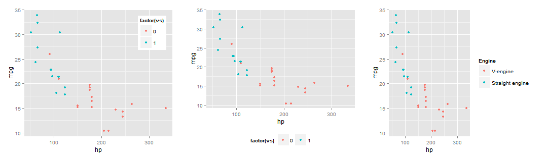
Change legend options
g1<-ggplot(mtc, aes(x = hp, y = mpg)) + geom_point(aes(color=factor(vs)))
#move legend inside
g2 <- g1 + theme(legend.position=c(1,1),legend.justification=c(1,1))
#move legend bottom
g3 <- g1 + theme(legend.position = "bottom")
#change labels
g4 <- g1 + scale_color_discrete(name ="Engine", labels=c("V-engine", "Straight engine"))
grid.arrange(g2, g3, g4, nrow=1)
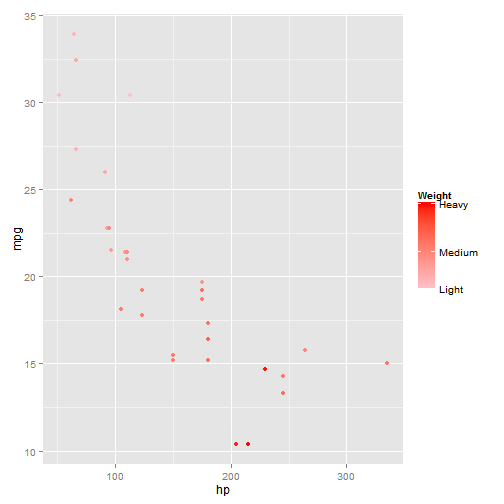
g5<-ggplot(mtc, aes(x = hp, y = mpg)) + geom_point(size=2, aes(color = wt))
g5 + scale_color_continuous(name="Weight", #name of legend
breaks = with(mtc, c(min(wt), mean(wt), max(wt))), #choose breaks of variable
labels = c("Light", "Medium", "Heavy"), #label
low = "pink",  #color of lowest value
high = "red"  #color of highest value
)
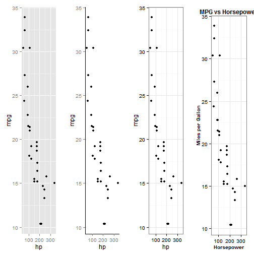
Change background color and style
g2 <- ggplot(mtc, aes(x = hp, y = mpg)) + geom_point()

# Completely clear all lines except axis lines and make background white
t1 <- theme(plot.background = element_blank(), panel.grid.major = element_blank(),
panel.grid.minor = element_blank(), panel.border = element_blank(), panel.background = element_blank(),
axis.line = element_line(size = 0.4))

# Use theme to change axis label style
t2 <- theme(axis.title.x = element_text(face = "bold", color = "black", size = 10),
axis.title.y = element_text(face = "bold", color = "black", size = 10),
plot.title = element_text(face = "bold", color = "black", size = 12))

g3 <- g2 + t1
g4 <- g2 + theme_bw()
g5 <- g2 + theme_bw() + t2 + labs(x = "Horsepower", y = "Miles per Gallon",
title = "MPG vs Horsepower")
grid.arrange(g2, g3, g4, g5, nrow = 1)
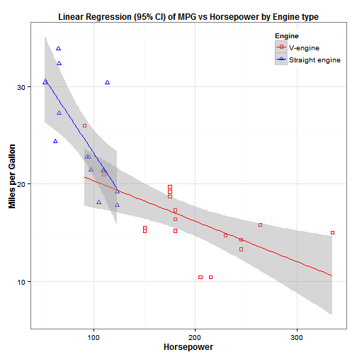
a nice graph using a combination of options
g2 <- ggplot(mtc, aes(x = hp, y = mpg)) + geom_point(size = 2, aes(color = factor(vs),
shape = factor(vs))) + geom_smooth(aes(color = factor(vs)), method = "lm",
se = TRUE) + scale_color_manual(name = "Engine", labels = c("V-engine",
"Straight engine"), values = c("red", "blue")) + scale_shape_manual(name = "Engine",
labels = c("V-engine", "Straight engine"), values = c(0, 2)) + theme_bw() +
theme(axis.title.x = element_text(face = "bold", color = "black", size = 12),
axis.title.y = element_text(face = "bold", color = "black", size = 12),
plot.title = element_text(face = "bold", color = "black", size = 12),
legend.position = c(1, 1), legend.justification = c(1, 1)) + labs(x = "Horsepower",
y = "Miles per Gallon", title = "Linear Regression (95% CI) of MPG vs Horsepower by Engine type")

g2
Barplots
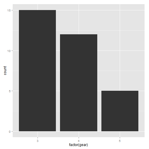
Basic barplot
ggplot(mtc, aes(x = factor(gear))) + geom_bar(stat = "bin")
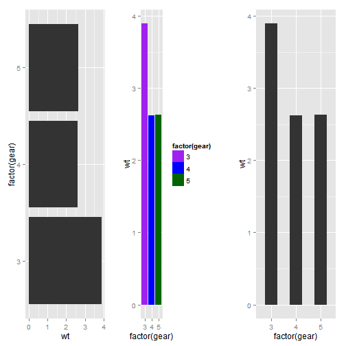
Horizontal bars, colors, width of bars
# 1. horizontal bars
p1 <- ggplot(mtc, aes(x = factor(gear), y = wt)) + stat_summary(fun.y = mean,
geom = "bar") + coord_flip()

# 2. change colors of bars
p2 <- ggplot(mtc, aes(x = factor(gear), y = wt, fill = factor(gear))) + stat_summary(fun.y = mean,
geom = "bar") + scale_fill_manual(values = c("purple", "blue", "darkgreen"))

# 3. change width of bars
p3 <- ggplot(mtc, aes(x = factor(gear), y = wt)) + stat_summary(fun.y = mean,
geom = "bar", aes(width = 0.5))

grid.arrange(p1, p2, p3, nrow = 1)
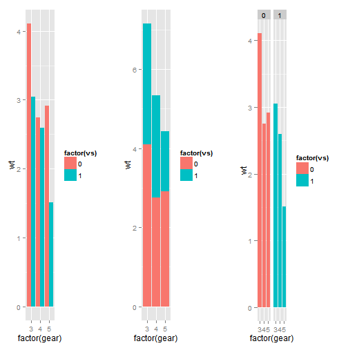
Split and color by another variable
# 1. next to each other
p1 <- ggplot(mtc, aes(x = factor(gear), y = wt, fill = factor(vs)), color = factor(vs)) +
stat_summary(fun.y = mean, position = position_dodge(), geom = "bar")

# 2. stacked
p2 <- ggplot(mtc, aes(x = factor(gear), y = wt, fill = factor(vs)), color = factor(vs)) +
stat_summary(fun.y = mean, position = "stack", geom = "bar")

# 3. with facets
p3 <- ggplot(mtc, aes(x = factor(gear), y = wt, fill = factor(vs)), color = factor(vs)) +
stat_summary(fun.y = mean, geom = "bar") + facet_wrap(~vs)

grid.arrange(p1, p2, p3, nrow = 1)
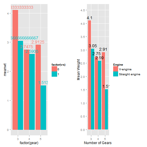
Add text to the bars, label axes, and label legend
ag.mtc <- aggregate(mtc$wt, by = list(mtc$gear, mtc$vs), FUN = mean)
colnames(ag.mtc) <- c("gear", "vs", "meanwt")
ag.mtc
gear vs meanwt
1    3  0  4.104
2    4  0  2.748
3    5  0  2.913
4    3  1  3.047
5    4  1  2.591
6    5  1  1.513
# 1. basic
g1 <- ggplot(ag.mtc, aes(x = factor(gear), y = meanwt, fill = factor(vs), color = factor(vs))) +
geom_bar(stat = "identity", position = position_dodge()) + geom_text(aes(y = meanwt,
ymax = meanwt, label = meanwt), position = position_dodge(width = 0.9),
vjust = -0.5)

# 2. fixing the yaxis problem, changing the color of text, legend labels,
# and rounding to 2 decimals
g2 <- ggplot(ag.mtc, aes(x = factor(gear), y = meanwt, fill = factor(vs))) +
geom_bar(stat = "identity", position = position_dodge()) + geom_text(aes(y = meanwt,
ymax = meanwt, label = round(meanwt, 2)), position = position_dodge(width = 0.9),
vjust = -0.5, color = "black") + scale_y_continuous("Mean Weight", limits = c(0,
4.5), breaks = seq(0, 4.5, 0.5)) + scale_x_discrete("Number of Gears") +
scale_fill_discrete(name = "Engine", labels = c("V-engine", "Straight engine"))

grid.arrange(g1, g2, nrow = 1)
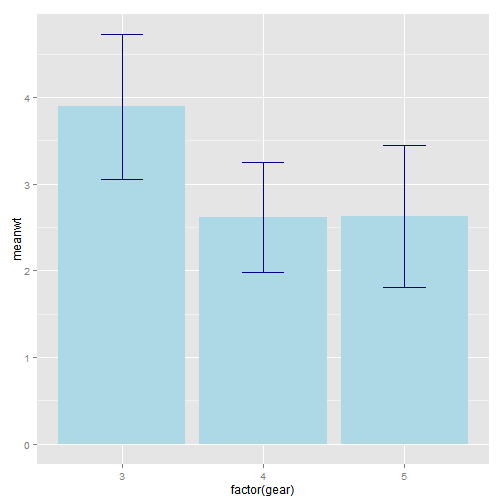
Add error bars
summary.mtc2 <- data.frame(gear = levels(as.factor(mtc$gear)), meanwt = tapply(mtc$wt,
mtc$gear, mean), sd = tapply(mtc$wt, mtc$gear, sd))
summary.mtc2
gear meanwt     sd
3    3  3.893 0.8330
4    4  2.617 0.6327
5    5  2.633 0.8189
ggplot(summary.mtc2, aes(x = factor(gear), y = meanwt)) + geom_bar(stat = "identity",
position = "dodge", fill = "lightblue") + geom_errorbar(aes(ymin = meanwt -
sd, ymax = meanwt + sd), width = 0.3, color = "darkblue")
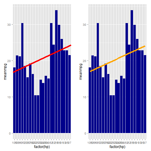
Add best fit line
# summarize data
summary.mtc3 <- data.frame(hp = levels(as.factor(mtc$hp)), meanmpg = tapply(mtc$mpg,
mtc$hp, mean))

# run a model
l <- summary(lm(meanmpg ~ as.numeric(hp), data = summary.mtc3))

# manually entering the intercept and slope
f1 <- ggplot(summary.mtc3, aes(x = factor(hp), y = meanmpg)) + geom_bar(stat = "identity",
fill = "darkblue") + geom_abline(aes(intercept = l$coef[1, 1], slope = l$coef[2,
1]), color = "red", size = 1.5)

# using stat_smooth to fit the line for you
f2 <- ggplot(summary.mtc3, aes(x = factor(hp), y = meanmpg)) + geom_bar(stat = "identity",
fill = "darkblue") + stat_smooth(aes(group = 1), method = "lm", se = FALSE,
color = "orange", size = 1.5)

grid.arrange(f1, f2, nrow = 1)
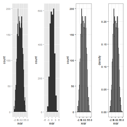
Histograms
set.seed(999)
xvar <- c(rnorm(1500, mean = -1), rnorm(1500, mean = 1.5))
yvar <- c(rnorm(1500, mean = 1), rnorm(1500, mean = 1.5))
zvar <- as.factor(c(rep(1, 1500), rep(2, 1500)))
xy <- data.frame(xvar, yvar, zvar)
# counts on y-axis
g1 <- ggplot(xy, aes(xvar)) + geom_histogram()  #horribly ugly default
g2 <- ggplot(xy, aes(xvar)) + geom_histogram(binwidth = 1)  #change binwidth
g3 <- ggplot(xy, aes(xvar)) + geom_histogram(fill = NA, color = "black") + theme_bw()  #nicer looking

# density on y-axis
g4 <- ggplot(xy, aes(x = xvar)) + geom_histogram(aes(y = ..density..), color = "black",
fill = NA) + theme_bw()

grid.arrange(g1, g2, g3, g4, nrow = 1)
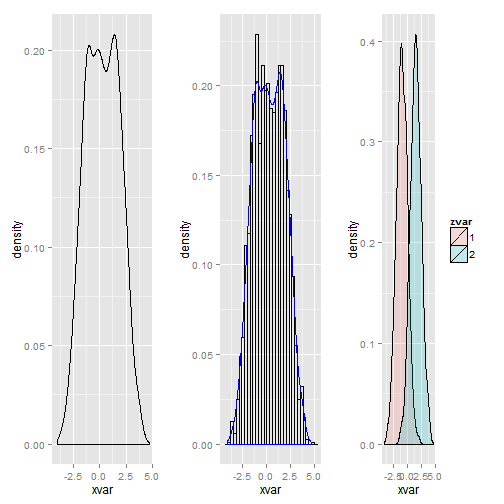
Density plots
# basic density
p1 <- ggplot(xy, aes(xvar)) + geom_density()

# histogram with density line overlaid
p2 <- ggplot(xy, aes(x = xvar)) + geom_histogram(aes(y = ..density..), color = "black",
fill = NA) + geom_density(color = "blue")

# split and color by third variable, alpha fades the color a bit
p3 <- ggplot(xy, aes(xvar, fill = zvar)) + geom_density(alpha = 0.2)

grid.arrange(p1, p2, p3, nrow = 1)
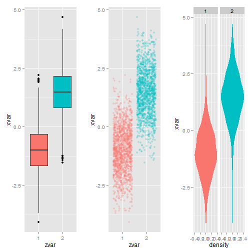
Boxplots
# boxplot
b1 <- ggplot(xy, aes(zvar, xvar)) + geom_boxplot(aes(fill = zvar)) + theme(legend.position = "none")

# jitter plot
b2 <- ggplot(xy, aes(zvar, xvar)) + geom_jitter(alpha = I(1/4), aes(color = zvar)) +
theme(legend.position = "none")

# violin plot
b3 <- ggplot(xy, aes(x = xvar)) + stat_density(aes(ymax = ..density.., ymin = -..density..,
fill = zvar, color = zvar), geom = "ribbon", position = "identity") + facet_grid(. ~
zvar) + coord_flip() + theme(legend.position = "none")

grid.arrange(b1, b2, b3, nrow = 1)
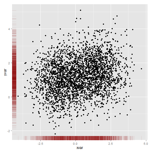
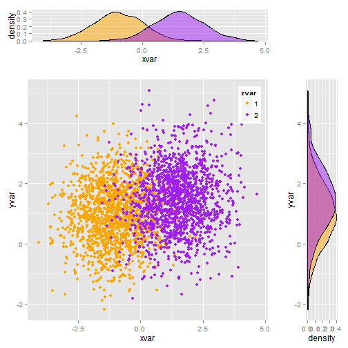
Putting multiple plots together
# rug plot
ggplot(xy, aes(xvar, yvar)) + geom_point() + geom_rug(col = "darkred", alpha = 0.1)
# placeholder plot - prints nothing at all
empty <- ggplot() + geom_point(aes(1, 1), colour = "white") + theme(plot.background = element_blank(),
panel.grid.major = element_blank(), panel.grid.minor = element_blank(),
panel.border = element_blank(), panel.background = element_blank(), axis.title.x = element_blank(),
axis.title.y = element_blank(), axis.text.x = element_blank(), axis.text.y = element_blank(),
axis.ticks = element_blank())

# scatterplot of x and y variables
scatter <- ggplot(xy, aes(xvar, yvar)) + geom_point(aes(color = zvar)) + scale_color_manual(values = c("orange",
"purple")) + theme(legend.position = c(1, 1), legend.justification = c(1,
1))

# marginal density of x - plot on top
plot_top <- ggplot(xy, aes(xvar, fill = zvar)) + geom_density(alpha = 0.5) +
scale_fill_manual(values = c("orange", "purple")) + theme(legend.position = "none")

# marginal density of y - plot on the right
plot_right <- ggplot(xy, aes(yvar, fill = zvar)) + geom_density(alpha = 0.5) +
coord_flip() + scale_fill_manual(values = c("orange", "purple")) + theme(legend.position = "none")

# arrange the plots together, with appropriate height and width for each row
# and column
grid.arrange(plot_top, empty, scatter, plot_right, ncol = 2, nrow = 2, widths = c(4,
1), heights = c(1, 4))
Original post is available here