scatterplot
~x means display numeric variable x alone.
| **y ~ x | A** means display the relationship between numeric variables y and x for each level of factor A. |
| **y ~ x | A*B** means display the relationship between numeric variables y and x separately for every combination of factor A and B levels. |
head(iris)
Sepal.Length Sepal.Width Petal.Length Petal.Width Species
1          5.1         3.5          1.4         0.2  setosa
2          4.9         3.0          1.4         0.2  setosa
3          4.7         3.2          1.3         0.2  setosa
4          4.6         3.1          1.5         0.2  setosa
5          5.0         3.6          1.4         0.2  setosa
6          5.4         3.9          1.7         0.4  setosa
table(iris$Species)
setosa versicolor  virginica
50         50         50
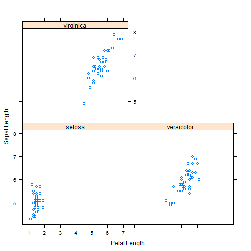
library(lattice)
xyplot(Sepal.Length ~ Petal.Length | Species, data = iris)
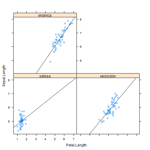
Add regression line
xyplot(Sepal.Length ~ Petal.Length | Species, data = iris, panel = function(x,
y, ...) {
panel.xyplot(x, y, ...)
panel.lmline(x, y, ...)
})
Add regression line using type()
xyplot(Sepal.Length ~ Petal.Length | Species, data = iris, type = c("p", "r"))
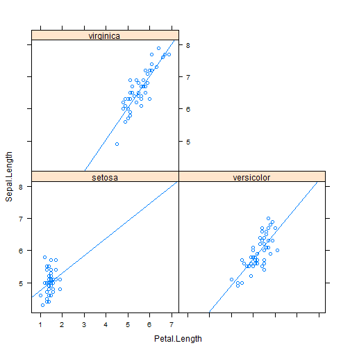
The type = argument can be used to enhance the figure with data-responsive elements. The default value type = “p”, which requests only points, type = “r” request a simple linear regression.