First, make your plot.
library(ggplot2)
str(msleep)
'data.frame':	83 obs. of  11 variables:
$ name        : chr  "Cheetah" "Owl monkey" "Mountain beaver" "Greater short-tailed shrew" ...
$ genus       : chr  "Acinonyx" "Aotus" "Aplodontia" "Blarina" ...
$ vore        : Factor w/ 4 levels "carni","herbi",..: 1 4 2 4 2 2 1 NA 1 2 ...
$ order       : chr  "Carnivora" "Primates" "Rodentia" "Soricomorpha" ...
$ conservation: Factor w/ 7 levels "","cd","domesticated",..: 5 NA 6 5 3 NA 7 NA 3 5 ...
$ sleep_total : num  12.1 17 14.4 14.9 4 14.4 8.7 7 10.1 3 ...
$ sleep_rem   : num  NA 1.8 2.4 2.3 0.7 2.2 1.4 NA 2.9 NA ...
$ sleep_cycle : num  NA NA NA 0.133 0.667 ...
$ awake       : num  11.9 7 9.6 9.1 20 9.6 15.3 17 13.9 21 ...
$ brainwt     : num  NA 0.0155 NA 0.00029 0.423 NA NA NA 0.07 0.0982 ...
$ bodywt      : num  50 0.48 1.35 0.019 600 ...
# remove rows with missing values
msleep <- na.omit(msleep)
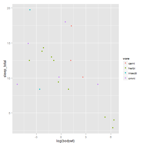
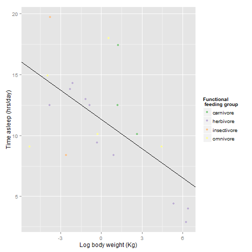
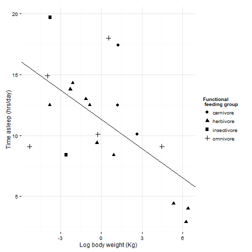
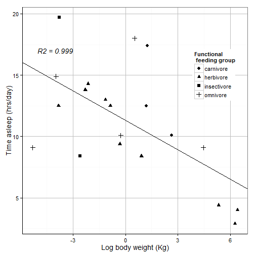
Let’s say we have written a groundbreaking paper on the relationship between body size and sleep time. Therefore, we want to present a plot of the log of body weight by the total sleep time.
sleepplot = ggplot(data = msleep, aes(x = log(bodywt), y = sleep_total)) + geom_point(aes(color = vore))
sleepplot
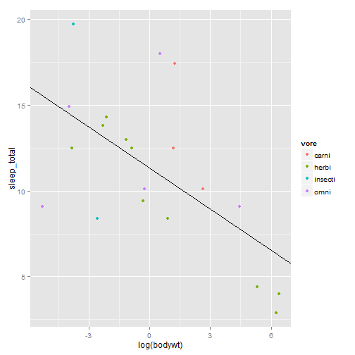
We made a beautiful model of this relationship
slp = lm(sleep_total ~ log(bodywt), data = msleep)
summary(slp)
Call:
lm(formula = sleep_total ~ log(bodywt), data = msleep)

Residuals:
Min     1Q Median     3Q    Max
-6.47  -2.20   0.44   1.29   7.10

Coefficients:
Estimate Std. Error t value Pr(>|t|)
(Intercept)   11.327      0.825   13.72  5.6e-11 ***
log(bodywt)   -0.800      0.243   -3.29    0.004 **
---

Signif. codes:  0 '***' 0.001 '**' 0.01 '*' 0.05 '.' 0.1 ' ' 1

Residual standard error: 3.69 on 18 degrees of freedom
Multiple R-squared:  0.376,	Adjusted R-squared:  0.341
F-statistic: 10.8 on 1 and 18 DF,  p-value: 0.00404
Let’s put the model on the plot
sleepplot = sleepplot + geom_abline(intercept = coef(slp)[1], slope = coef(slp)[2])
sleepplot
It’s beautiful! I love it! Unfortunately, you want to submit to Science (you might as well aim high), and this is what they say about figures
So we have several problems: * gray background * Poor labels (need units, capital letters, larger font on axes) * Poor legend * Poor color scheme (avoid red and green together, more contrast needed) * Not correct file format or resolution (want a PDF with at least 600dpi)
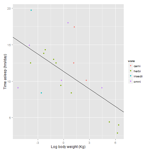
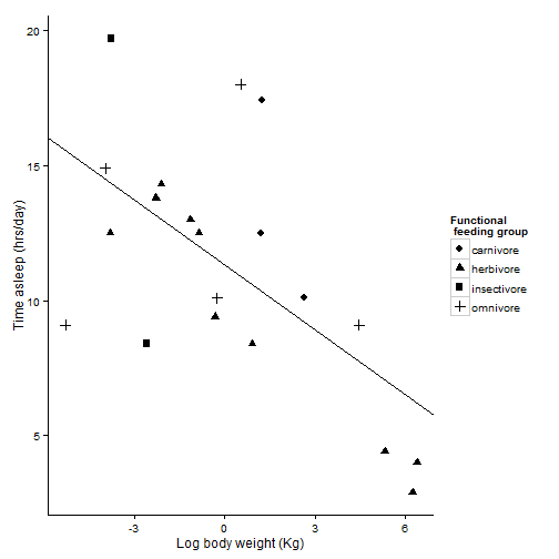
First make the labels a little more useful.
sleepplot = sleepplot + labs(x = "Log body weight (Kg)", y = "Time asleep (hrs/day)")
sleepplot
Now let’s fix the legend. You would think you do this with some sort of “legend” command, but no, what you are looking for is “scale”.
sleepplot + scale_color_discrete(name = "Functional\n feeding group", labels = c("carnivore",
"herbivore", "insectivore", "omnivore"))
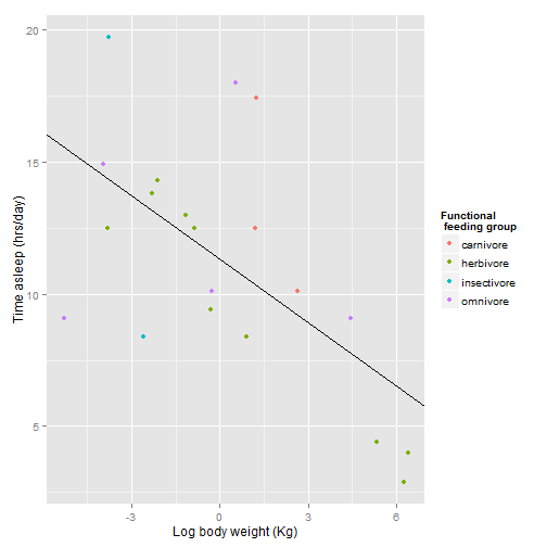
If you haven’t figured it out yet, putting “\n” in a text string gives you a line break. It took me WAY to long to discover that.
ggplot automatically gives you evenly spaced hues for color variations, but this is not necessarily the best way to get a good contrasting color scheme. You may want to try scale_color_brewer for better contrasts.See http://colorbrewer2.org for more information.
sleepplot + scale_color_brewer(name = "Functional \n feeding group", labels = c("carnivore",
"herbivore", "insectivore", "omnivore"), type = "qual", palette = 1)
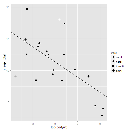
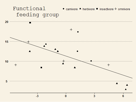
Color figures cost an extra $700 on top of the normal page charges! Let’s try something else. This time we will vary the feeding groups by shapes instead of colors.
sleepplot2 = ggplot(data = msleep, aes(x = log(bodywt), y = sleep_total)) +
geom_point(aes(shape = vore), size = 3) + geom_abline(intercept = coef(slp)[1],
slope = coef(slp)[2])
sleepplot2
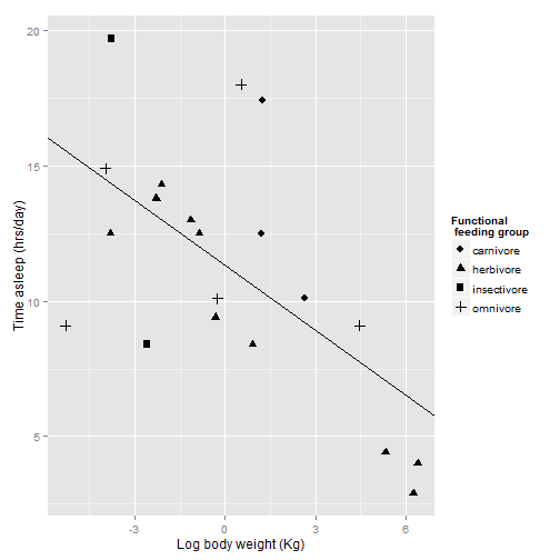
Now to fix the labels and legend again. we will use scale_shape_discrete instead of scale_color_discrete
sleepplot2 = sleepplot2 + labs(x = "Log body weight (Kg)", y = "Time asleep (hrs/day)") +
scale_shape_discrete(name = "Functional \n feeding group", labels = c("carnivore",
"herbivore", "insectivore", "omnivore"))
sleepplot2
Now, let’s work on how the plot looks overall. ggplot uses “themes” to adjust plot appearence without changes the actual presentation of the data.
# sleepplot2 + theme_bw(base_size=12, base_family = 'Helvetica')
sleepplot2 + theme_bw()  # on windows
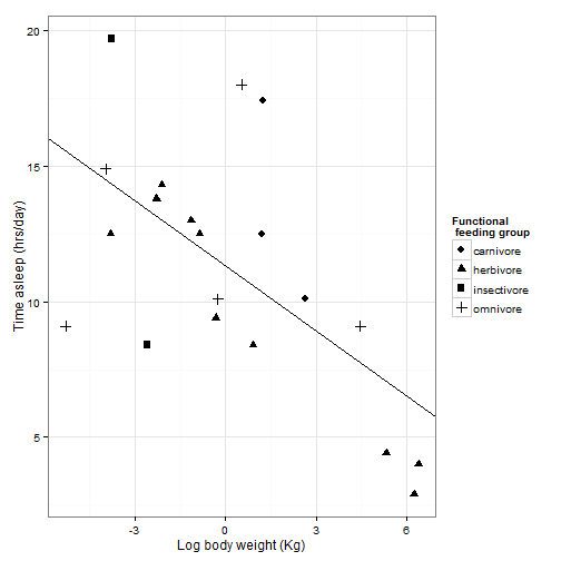
theme_bw() will get rid of the background, and gives you options to change the font. Science recomends Helvetica, wich happens to be R’s default, but we will specify it here anyway. Check out the other fonts out here: ??postscriptFonts. For even more fonts, see the {extrafont} package. Other pre-set themes can change the look of your plot.
sleepplot2 + theme_minimal()
sleepplot2 + theme_classic()
For more themes:
library(ggthemes)
If you want to publish in the Wall Street Journal
sleepplot2 + theme_wsj()
But we want to publish in Science, not the Wall Street Journal, so let’s get back to our black and white theme.
sleepplot2 = sleepplot2 + theme_bw(base_size = 12, base_family = "Helvetica")
sleepplot2

You can’t really see the gridlines with the bw theme, so we are going to tweak the pre-set theme using the theme function. theme allows you to do all kinds of stuff involved with how the plot looks. ?theme
sleepplot2 +
#increase size of gridlines
theme(panel.grid.major = element_line(size = .5, color = "grey"),
#increase size of axis lines
axis.line = element_line(size=.7, color = "black"),
#Adjust legend position to maximize space, use a vector of proportion
#across the plot and up the plot where you want the legend.
#You can also use "left", "right", "top", "bottom", for legends on the side of the plot
legend.position = c(.85,.7),
#increase the font size
text = element_text(size=14))

You can save this theme for later use
science_theme = theme(panel.grid.major = element_line(size = 0.5, color = "grey"),
axis.line = element_line(size = 0.7, color = "black"), legend.position = c(0.85,
0.7), text = element_text(size = 14))
sleepplot2 = sleepplot2 + science_theme
sleepplot2

That looks pretty good. Now we need to get it exported properly. The instructions say the figure should be sized to fit in one or two columns (2.3 or 4.6 inches), so we want them to look good at that resolution.
pdf(file = "sleepplot.pdf", width= 6, height = 4, #' see how it looks at this size
useDingbats=F) #I have had trouble when uploading figures with digbats before, so I don't use them
sleepplot2 #print our plot
dev.off() #stop making pdfs
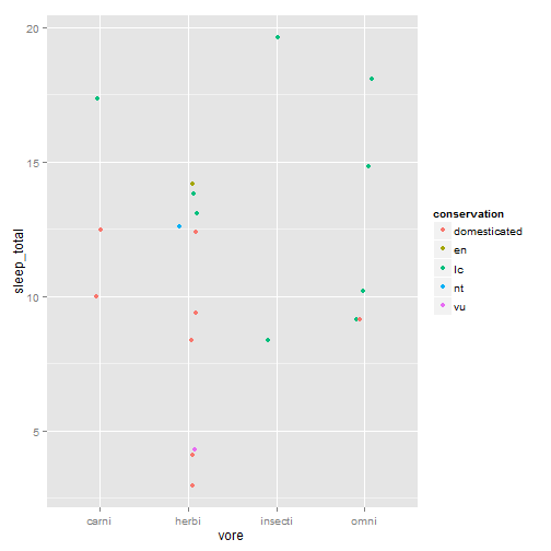
A few other tricks to improve the look of your plots: Let’s say we are grouping things by categories instead of a regression.
sleepcat = ggplot(msleep, aes(x = vore, y = sleep_total, color = conservation))
sleepcat + geom_point()
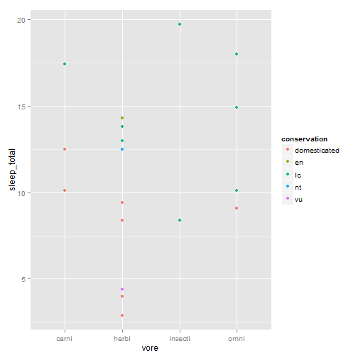
It’s hard to see what’s going on there, so we can jitter the points to make them more visible.
sleepcat + geom_point(position = position_jitter(w = 0.1))
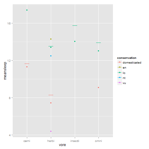
Maybe this would be better with averages and error bars instead of every point:
library(plyr)
msleepave = ddply(msleep, .(vore, conservation), summarize, meansleep = mean(sleep_total),
sdsleep = sd(sleep_total)/sqrt(22))
sleepmean = ggplot(msleepave, aes(x = vore, y = meansleep, color = conservation))
#' Plot it with means and error bars +/- 1 stadard deviation
sleepmean + geom_point() + geom_errorbar(aes(ymax = meansleep + sdsleep, ymin = meansleep +
sdsleep), width = 0.2)
#' Spread them out, but in an orderly fashion this time, with position_dodge rather than jitter
sleepmean + geom_point(position = position_dodge(width = 0.5, height = 0), size = 2) +
geom_errorbar(aes(ymax = meansleep + sdsleep, ymin = meansleep - sdsleep),
position = position_dodge(width = 0.5, height = 0), width = 0.5)
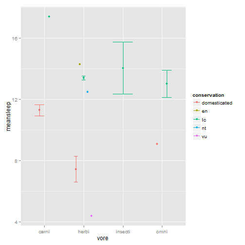
Note that dodging the points gives the conservation status in the same order for each feeding type category. A little more organized. Some other things you might want to do with formatting:
Add annotation to the plot
sleepplot2 + annotate("text", label = "R2 = 0.999", x = -4, y = 17)

Let’s put that annotation in italics
sleepplot2 + annotate("text", label = "R2 = 0.999", x = -4, y = 17, fontface = 3)
NOW. Let’s put half that annotation in italics, the other half plain, then insert five greek characters and rotate it 90 degrees! OR we can beat our head against a wall until it explodes and export our plot into an actual graphics program.
Not everything has to be done in R. ‘SVG’ files are vector graphic files that can be easily edited in the FREE GUI-based program Inkscape. Make and SVG and you can edit it by hand for final tweaks. Inkscape can also edit and export PDFs.
svg(filename = "sleepplot.svg", width = 6, height = 4)
sleepplot2
dev.off()