Bar plot
Simple Bar Plot
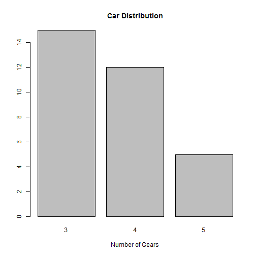
counts <- table(mtcars$gear)
barplot(counts, main = "Car Distribution", xlab = "Number of Gears")
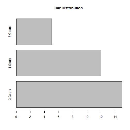
Simple Horizontal Bar Plot with Added Labels
barplot(counts, main = "Car Distribution", horiz = TRUE, names.arg = c("3 Gears",
"4 Gears", "5 Gears"))
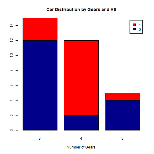
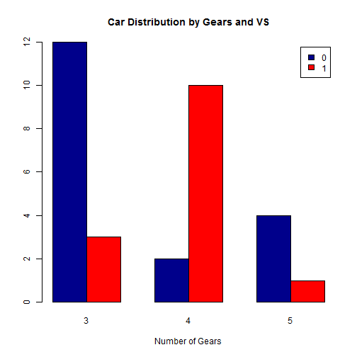
Stacked Bar Plot
counts <- table(mtcars$vs, mtcars$gear)
barplot(counts, main = "Car Distribution by Gears and VS", xlab = "Number of Gears",
col = c("darkblue", "red"), legend = rownames(counts))
Grouped Bar Plot
barplot(counts, main = "Car Distribution by Gears and VS", xlab = "Number of Gears",
col = c("darkblue", "red"), legend = rownames(counts), beside = TRUE)
Pie Charts
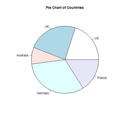
Simple Pie Chart
slices <- c(10, 12, 4, 16, 8)
lbls <- c("US", "UK", "Australia", "Germany", "France")
pie(slices, labels = lbls, main = "Pie Chart of Countries")
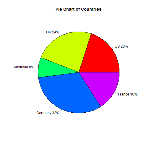
Pie Chart with Annotated Percentages
pct <- round(slices/sum(slices) * 100)
lbls <- paste(lbls, pct)  # add percents to labels
lbls <- paste(lbls, "%", sep = "")  # ad % to labels
pie(slices, labels = lbls, col = rainbow(length(lbls)), main = "Pie Chart of Countries")
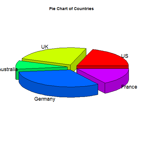
3D Pie Chart
library(plotrix)
slices <- c(10, 12, 4, 16, 8)
lbls <- c("US", "UK", "Australia", "Germany", "France")
pie3D(slices, labels = lbls, explode = 0.1, main = "Pie Chart of Countries ")
Scatterplots
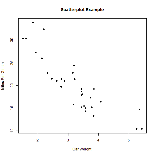
Simple Scatterplot
plot(mtcars$wt, mtcars$mpg, main = "Scatterplot Example", xlab = "Car Weight ",
ylab = "Miles Per Gallon ", pch = 19)
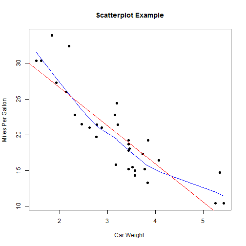
Add fit lines
attach(mtcars)
plot(wt, mpg, main = "Scatterplot Example", xlab = "Car Weight ", ylab = "Miles Per Gallon ",
pch = 19)
abline(lm(mpg ~ wt), col = "red")  # regression line (y~x)
lines(lowess(wt, mpg), col = "blue")  # lowess line (x,y)
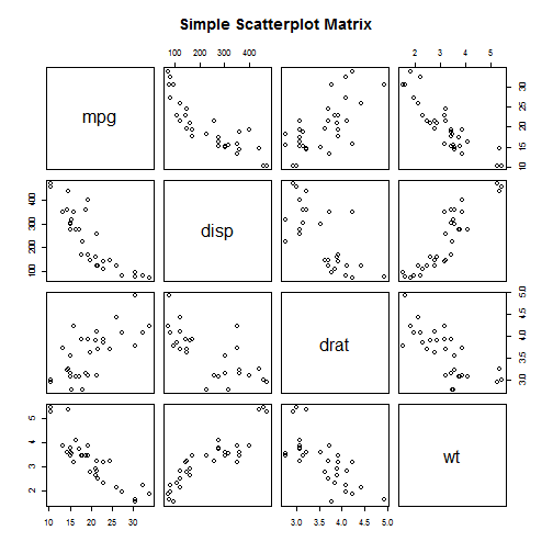
Scatterplot Matrices
Basic Scatterplot Matrix
pairs(~mpg + disp + drat + wt, data = mtcars, main = "Simple Scatterplot Matrix")
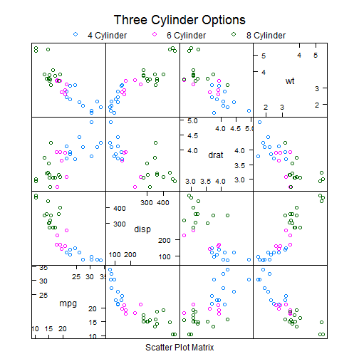
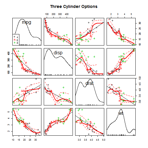
Scatterplot Matrices from the lattice Package
The lattice package provides options to condition the scatterplot matrix on a factor.
library(lattice)
super.sym <- trellis.par.get("superpose.symbol")
splom(mtcars[c(1, 3, 5, 6)], groups = cyl, data = mtcars, panel = panel.superpose,
key = list(title = "Three Cylinder Options", columns = 3, points = list(pch = super.sym$pch[1:3],
col = super.sym$col[1:3]), text = list(c("4 Cylinder", "6 Cylinder",
"8 Cylinder"))))
Scatterplot Matrices from the car Package
The car package can condition the scatterplot matrix on a factor, and optionally include lowess and linear best fit lines, and boxplot, densities, or histograms in the principal diagonal, as well as rug plots in the margins of the cells.
library(car)
scatterplot.matrix(~mpg + disp + drat + wt | cyl, data = mtcars, main = "Three Cylinder Options")
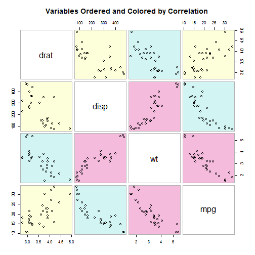
Scatterplot Matrices from the glus Package
The gclus package provides options to rearrange the variables so that those with higher correlations are closer to the principal diagonal. It can also color code the cells to reflect the size of the correlations.
library(gclus)
dta <- mtcars[c(1, 3, 5, 6)]  # get data
dta.r <- abs(cor(dta))  # get correlations
dta.col <- dmat.color(dta.r)  # get colors
# reorder variables so those with highest correlation are closest to the
# diagonal
dta.o <- order.single(dta.r)
cpairs(dta, dta.o, panel.colors = dta.col, gap = 0.5, main = "Variables Ordered and Colored by Correlation")
Histograms
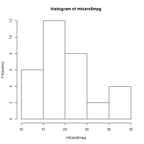
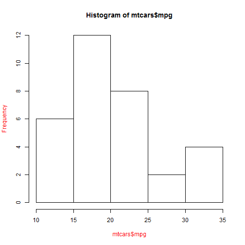
Simple Histogram
hist(mtcars$mpg)
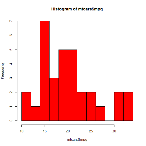
Colored Histogram with Different Number of Bins
hist(mtcars$mpg, breaks = 12, col = "red")
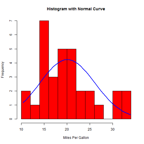
Add a Normal Curve
x <- mtcars$mpg
h <- hist(x, breaks = 10, col = "red", xlab = "Miles Per Gallon", main = "Histogram with Normal Curve")
xfit <- seq(min(x), max(x), length = 40)
yfit <- dnorm(xfit, mean = mean(x), sd = sd(x))
yfit <- yfit * diff(h$mids[1:2]) * length(x)
lines(xfit, yfit, col = "blue", lwd = 2)
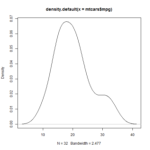
Kernel Density Plots
Kernal density plots are usually a much more effective way to view the distribution of a variable. Create the plot using plot(density(x)) where x is a numeric vector.
simple Kernel Density Plot
plot(density(mtcars$mpg))
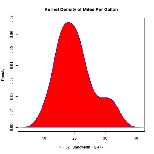
Filled Density Plot
d <- density(mtcars$mpg)
plot(d, main = "Kernel Density of Miles Per Gallon")
polygon(d, col = "red", border = "blue")
par()
xaxt=”n” will suppresses plotting of the axis
# par() # view current settings
opar <- par()  # make a copy of current settings
par(col.lab = "red")  # red x and y labels
hist(mtcars$mpg)  # create a plot with these new settings
par(opar) # restore original settings
text() and mtext()
text() places text within the graph while mtext() places text in one of the four margins.
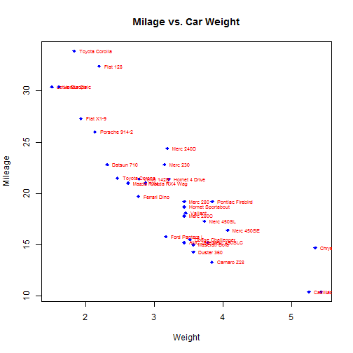
# attach(mtcars)
plot(wt, mpg, main = "Milage vs. Car Weight", xlab = "Weight", ylab = "Mileage",
pch = 18, col = "blue")
text(wt, mpg, row.names(mtcars), cex = 0.6, pos = 4, col = "red")
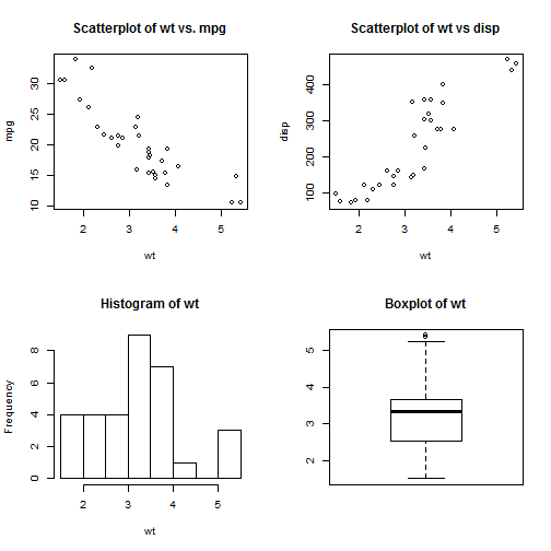
combine figures
par(mfrow = c(2, 2))
plot(wt, mpg, main = "Scatterplot of wt vs. mpg")
plot(wt, disp, main = "Scatterplot of wt vs disp")
hist(wt, main = "Histogram of wt")
boxplot(wt, main = "Boxplot of wt")
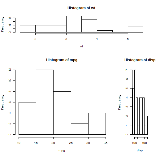
# One figure in row 1 and two figures in row 2 row 1 is 1/3 the height of
# row 2 column 2 is 1/4 the width of the column 1
layout(matrix(c(1, 1, 2, 3), 2, 2, byrow = TRUE), widths = c(3, 1), heights = c(1,
2))
hist(wt)
hist(mpg)
hist(disp)
# Add boxplots to a scatterplot
par(fig = c(0, 0.8, 0, 0.8), new = TRUE)
plot(mtcars$wt, mtcars$mpg, xlab = "Miles Per Gallon", ylab = "Car Weight")
par(fig = c(0, 0.8, 0.55, 1), new = TRUE)
boxplot(mtcars$wt, horizontal = TRUE, axes = FALSE)
par(fig = c(0.65, 1, 0, 0.8), new = TRUE)
boxplot(mtcars$mpg, axes = FALSE)
mtext("Enhanced Scatterplot", side = 3, outer = TRUE, line = -3)
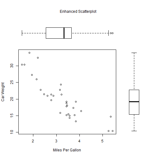
To understand this graph, think of the full graph area as going from (0,0) in the lower left corner to (1,1) in the upper right corner. The format of the fig= parameter is a numerical vector of the form c(x1, x2, y1, y2). The first fig= sets up the scatterplot going from 0 to 0.8 on the x axis and 0 to 0.8 on the y axis. The top boxplot goes from 0 to 0.8 on the x axis and 0.55 to 1 on the y axis. I chose 0.55 rather than 0.8 so that the top figure will be pulled closer to the scatter plot. The right hand boxplot goes from 0.65 to 1 on the x axis and 0 to 0.8 on the y axis. Again, I chose a value to pull the right hand boxplot closer to the scatterplot. You have to experiment to get it just right.
legend()
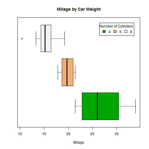
# attach(mtcars)
boxplot(mpg ~ cyl, main = "Milage by Car Weight", yaxt = "n", xlab = "Milage",
horizontal = TRUE, col = terrain.colors(3))
legend("topright", inset = 0.05, title = "Number of Cylinders", c("4", "6",
"8"), fill = terrain.colors(3), horiz = TRUE)