1. NBA players data in 2014-2015 season
1.1 columns of the data
Rk -- Rank
Pos -- Position
Age -- Age of Player at the start of February 1st of that season.
Tm -- Team
G -- Games
GS -- Games Started
MP -- Minutes Played
FG -- Field Goals
FGA -- Field Goal Attempts
FGR -- Field Goal Percentage
F3P -- 3-Point Field Goals
F3PA -- 3-Point Field Goal Attempts
F3PR -- FG% on 3-Pt FGAs.
F2P -- 2-Point Field Goals
F2PA -- 2-point Field Goal Attempts
F2P -- FG% on 2-Pt FGAs.
eFGR -- Effective Field Goal Percentage
FT -- Free Throws
FTA -- Free Throw Attempts
FTR -- Free Throw Percentage
ORB -- Offensive Rebounds
DRB -- Defensive Rebounds
TRB -- Total Rebounds
AST -- Assists
STL -- Steals
BLK -- Blocks
TOV -- Turnovers
PF -- Personal Fouls
PTS -- Points
1.2 read data
#dat <- read.csv("nba20142015.csv")
library(RCurl)
myCsv <- getURL("https://dl.dropboxusercontent.com/u/8272421/bioinfor/nba20142015.csv",
                ssl.verifypeer = FALSE)
dat <- read.csv(textConnection(myCsv))
1.3 select columns for heatmap
Only select the top 20 players with highest points.
keeps <- c('Player','G','FGR','F3PR','F2PR','FTR','ORB','DRB','AST','STL','BLK','TOV','PF','PTS')
subdat <- dat[,names(dat) %in% keeps]
plotdat <- subdat[order(-subdat[,"PTS"]),][1:20,]
Order y-axis inside a geom_tile by PTS. The y-axis is ordered alphabetically in default.
plotdat$Player <- factor(plotdat$Player, levels=(plotdat$Player)[order(plotdat$PTS)])
1.4 prepare for ggplot2
transform data from wide-format to long-format.
library(reshape2)
plotdat.m <- melt(plotdat)
rescale data so that they were between 0 and 1.
library(plyr)
library(scales)
plotdat.m <- ddply(plotdat.m, .(variable), transform, rescale = rescale(value))
1.5 prepare for heatmap, heatmap.2 and d3heatmap
row.names(plotdat) <- plotdat$Player
plotdat.h <- plotdat[,2:14]
plotdat.h <- data.matrix(plotdat.h)
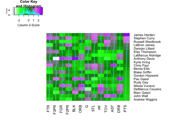
2 Heatmap
#my_col = colorRampPalette(c("yellow","red"))(256)
my_col = colorRampPalette(c("white","green","green4","violet","purple"))(256)
2.1 heatmap in stats package
heatmap(plotdat.h, col = my_col, scale="column",Rowv=NA, Colv=NA)

2.2 heatmap.2 in gplots package
Rowv=FALSE turns off row reorder.
library(gplots)
heatmap.2(plotdat.h, col = my_col, scale="column",dendrogram="none",margins = c(5, 10),Rowv=FALSE)
2.3 d3heatmap in d3heatmap package
library(d3heatmap)
d3heatmap(plotdat.h, scale = "column",dendrogram="none",col = my_col)

2.4 heatmap by ggplot2
library(ggplot2)
ggplot(plotdat.m, aes(variable, Player)) +
  geom_tile(aes(fill = rescale), colour = "white")+
  scale_fill_gradient(low = "yellow", high = "red")+
  theme(axis.ticks = element_blank(),
               axis.text.x = element_text(
                 angle = 330, hjust = 0),
               axis.title = element_blank(),
               legend.title = element_blank()
               )
