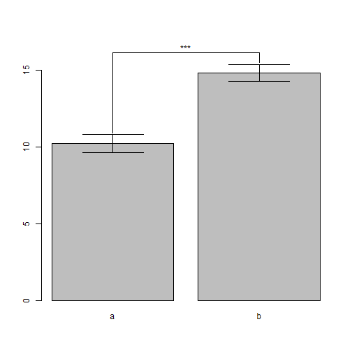
Bar plot with significant differences
Simulate raw data for t-test
set.seed(123456)
alpha = 0.05
a = rnorm(50, 10, 2)
b = rnorm(50, 15, 2)
df = data.frame(a = a, b = b)
test = t.test(df)
test
One Sample t-test

data:  df
t = 41.22, df = 99, p-value < 2.2e-16
alternative hypothesis: true mean is not equal to 0
95 percent confidence interval:
11.93 13.14
sample estimates:
mean of x
12.53
Calculate statistics (95% confidence interval)
means <- sapply(df, mean)
lowers <- sapply(df, function(v) t.test(v, conf.level = 1 - alpha)$conf.int[1])
uppers <- sapply(df, function(v) t.test(v, conf.level = 1 - alpha)$conf.int[2])
Or,
means <- sapply(df, mean)
sd <- sapply(df, sd)
n <- sapply(df, length)
se <- sd/sqrt(n)
lowers <- means - qt(1-alpha/2, df=n)*se
uppers <- means + qt(1-alpha/2, df=n)*se
Use gplots to draw the bar plot
library(gplots)
ymax = max(uppers)

# bar plot with 95% confidence interval
bp <- barplot2(means, plot.ci = TRUE, ci.l = lowers, ci.u = uppers, xpd = FALSE,
ylim = c(0, ymax * 1.1))

# Add connection lines
x.cord <- sapply(bp, function(x) rep(x, each = length(uppers)))
y.cord <- rbind(c(uppers * 1.01), rep(1.05 * ymax, length(uppers)))
lines(x.cord[, 1], y.cord[, 1])
lines(x.cord[, 2], y.cord[, 2])
lines(x.cord[2, ], y.cord[2, ])

# Add significant star
x.star <- mean(bp)
y.star <- 1.08 * ymax

# Signif. codes: 0 ‘***’ 0.001 ‘**’ 0.01 ‘*’ 0.05 ‘.’ 0.1 ‘ ’ 1
star = ""
if (test$p.value < 0.001) {
star = "***"
} else if (test$p.value < 0.01) {
star = "**"
} else if (test$p.value < 0.05) {
star = "*"
} else if (test$p.value < 0.1) {
star = "."
} else {
star = " "
}

text(star, x = x.star, y = y.star)
Read more
Barplot with significant differences and interactions?
Bar plot with error bars in R
Wily data analysis